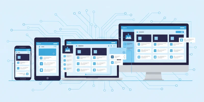
Building web applications that look and function perfectly on every device is no longer optional. Users access websites through phones, tablets, laptops, and even TVs, which means a single static layout will not meet everyone’s needs. A Full Stack Developer Course in Trivandrum at FITA Academy emphasizes the importance of responsive design, ensuring that your web app adapts smoothly to different screen sizes and exposures, providing an optimal viewing experience for all users. Understanding modern responsive design patterns helps developers create flexible layouts that are both beautiful and functional.
What is Responsive Design
Responsive design is an approach that makes web layouts flexible and adaptive. It allows elements such as text, images, and navigation to adjust automatically based on the user’s screen size. This design philosophy focuses on creating fluid layouts rather than fixed-width ones. By using responsive techniques, developers can ensure that a web app maintains usability, readability, and visual appeal across all devices.
Why Responsive Design Matters
Modern users expect fast and seamless browsing experiences regardless of their device. A non-responsive web app can frustrate users and lead to higher bounce rates. Responsive design patterns help developers improve user experience, increase engagement, and boost overall search visibility. They also reduce the need to build separate desktop and mobile versions, saving time and resources. Enroll in the Full Stack Developer Course in Kochi to master responsive design and build web apps that perform flawlessly on any device.
Key Responsive Design Patterns
1. Fluid Grid Layout
A fluid grid layout is one of the most common responsive patterns. Instead of using fixed pixel values, it uses relative units like percentages. This allows content to resize naturally as the viewport changes. It keeps the structure consistent while ensuring that elements do not overlap or break on smaller screens.
2. Column Drop Pattern
The column drop pattern rearranges multiple columns into a single vertical layout on smaller screens. This design ensures that each piece of content remains visible and readable without requiring users to zoom or scroll horizontally.
3. Off-Canvas Pattern
The off-canvas pattern hides secondary content, such as navigation menus, off the main view. Users can reveal this hidden content with a button or gesture. This approach keeps the interface clean while maximizing space for primary content, especially on mobile devices. Learn to implement such modern web design techniques by enrolling in the Full Stack Developer Course in Mumbai and enhance your skills in building responsive web applications.
4. Layout Shifter Pattern
The layout shifter pattern dynamically changes the structure of a page based on screen size. For example, a three-column layout on desktop might shift to two columns on tablets and one column on mobile. It is highly adaptable and works well for complex web apps.
5. Mostly Fluid Pattern
This pattern combines fluid and fixed elements. The layout remains fluid up to a certain breakpoint, after which specific components become fixed. It is a balanced approach that maintains visual consistency while accommodating different devices.
Best Practices for Implementing Responsive Design
When applying responsive design patterns, focus on simplicity and usability. Use flexible images that scale smoothly without losing quality. Make sure that the touch targets are sufficiently large for users on mobile devices. Test your web app across various devices and resolutions to verify that every element behaves correctly. Performance optimization is equally important since responsive sites should load quickly on all networks.
Responsive design patterns are crucial for creating contemporary web applications that provide a consistent experience on various devices. By using flexible layouts and thoughtful patterns like fluid grids and off-canvas navigation, developers can create designs that adapt gracefully to any screen.
Prioritizing responsiveness not only improves user satisfaction but also enhances SEO and accessibility. In today’s multi-device world, a responsive approach is the foundation of every successful web application. Take your skills to the next level by joining the Full Stack Developer Course in Jaipur and learn to build fully responsive web applications like a professional.
Also check: Client-Server Architecture Explained for Full Stack Developers